
Tutorial: Kernel Density Estimation Explained
Tutorial type: Algorithm oriented, written in Python
Requirements: Python >= 2.7.0, NumPy >= 1.6.1, Matplotlib >= 1.4.3 (To run Python code, the output is given in the article)
What is KDE?
Kernel density estimation or KDE is a non-parametric way to estimate the probability density function of a random variable. In other words the aim of KDE is to find probability density function (PDF) for a given dataset. How it differs from normalized histogram approach? Well, it smooths the around values of PDF. Let's take a look at KDE using Gaussian kernel in multiple examples .
Gaussian kernel
First let's remember how Gaussian PDF looks like:![]()
For selecting the kernel we must consider the main rule for PDF - it sums up to one. So the kernel which will define the PDF must also sum up to one:![]()
In KDE sigma from Gaussian is called bandwidth parameter, because it defines how much the function is spread. The kernel function is defined by: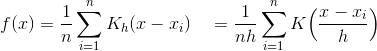
where h is a bandwidth and n is the number of data points. This final PDF is the average sum of Gaussian PDF for every point for every dx.
One data point example
The easiest way to grasp the idea is to use one-two points example. Consider the code and output:
1 2 3 4 5 6 7 8 9 10 11 12 13 14 15 16 17 18 19 20 21 22 23 24 25 26 27 28 29 30 31 32 33 34 35 36 37 38 39 40 41 42 | import numpy as np import matplotlib.pyplot as plt #https://en.wikipedia.org/wiki/Gaussian_function def gaussian(x,b=1): return np.exp(-x**2/(2*b**2))/(b*np.sqrt(2*np.pi)) #Let's take any value X=np.array([2.2]) # Plot all available kernels X_plot = np.linspace(-1, 6, 100)[:, None] bins = np.linspace(0, 5, 21) bins[1]-bins[0] fig, ax = plt.subplots(2, 3, sharex=True, sharey=True, figsize=(14,8)) fig.subplots_adjust(left=0.05, right=0.95, hspace=0.05, wspace=0.05) bins = np.linspace(-1, 5, 16) bins[1]-bins[0] ax[0, 0].hist(X[:], bins=bins, fc='#AAAAFF', normed=False) ax[0, 0].text(0, 1.25, "Histogram, NOT NORMED, bin=0.4") bins = np.linspace(-1, 5, 9) bins[1]-bins[0] ax[0, 1].hist(X[:], bins=bins + 0.75, fc='#AAAAFF', normed=True) ax[0, 1].text(0, 1.25, "Histogram, normed, bin=0.75") bins = np.linspace(-1, 5, 5) bins[1]-bins[0] ax[0, 2].hist(X[:], bins=bins + 0.75, fc='#AAAAFF', normed=True) ax[0, 2].text(0, 1.25, "Histogram, normed, bin=1.5") ax[1, 0].fill(X_plot, gaussian(X_plot-X[0]), '-k', fc='#AAAAFF') ax[1, 0].text(0, 1.25, "Gaussian, middle on X=2.2, b=1") ax[1, 1].fill(X_plot, gaussian(X_plot-X[0],0.6), '-k', fc='#AAAAFF') ax[1, 1].text(0, 1.25, "Gaussian, middle on X=2.2, b=0.6") ax[1, 2].fill(X_plot, gaussian(X_plot-X[0],0.35), '-k', fc='#AAAAFF') ax[1, 2].text(0, 1.25, "Gaussian, middle on X=2.2, b=0.35") fig.savefig("One_Point_Example.jpg") |
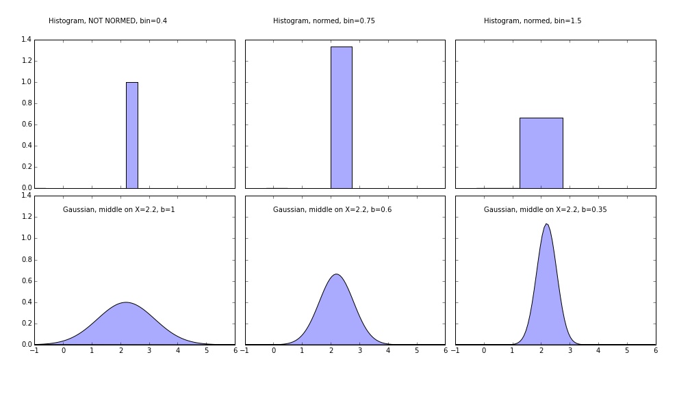 It's the fastest way to understand the main difference between kernel methods and normalized histograms. PDF can have values higher than one, because it is only it's integral that matters. First (top left) image is NOT normed histogram - the width of the bin does not matter here. All of the other plots integrate to 1! Three lower graphs are the same Gaussian kernel with different bandwidth value. Of course the discrete result histogram with narrow bin makes much more sense in the case of one point (the distribution is not natural here, obviously).
Two data points example
Example with two points explains visually how the probability densities sums up to get the integral value equal to one. It's simple average of all the probability densities which make up the final result.
1 2 3 4 5 6 7 8 9 10 11 12 13 14 15 16 17 18 19 20 21 22 23 24 25 26 27 28 29 30 31 32 33 34 35 36 37 38 39 40 41 42 43 44 45 46 | import numpy as np import matplotlib.pyplot as plt #https://en.wikipedia.org/wiki/Gaussian_function def gaussian(x,b=1): return np.exp(-x**2/(2*b**2))/(b*np.sqrt(2*np.pi)) #Let's take any value X=np.array([2.2, 3.9]) # Plot all available kernels X_plot = np.linspace(-1, 7, 100)[:, None] bins = np.linspace(-1, 5, 20) bins[1]-bins[0] fig, ax = plt.subplots(2, 3, sharex=True, sharey=True, figsize=(14,8)) fig.subplots_adjust(left=0.05, right=0.95, hspace=0.05, wspace=0.05) ax[0, 0].hist(X[:], bins=bins + 0.75, fc='#AAAAFF', normed=False) ax[0, 0].text(0, 0.9, "Histogram, bin=0.32") bins = np.linspace(-1, 5, 9) bins[1]-bins[0] ax[0, 1].hist(X[:], bins=bins + 0.75, fc='#AAAAFF', normed=True) ax[0, 1].text(0, 0.9, "Histogram, normed, bin=0.75") bins = np.linspace(-1, 5, 5) bins[1]-bins[0] ax[0, 2].hist(X[:], bins=bins + 0.75, fc='#AAAAFF', normed=True) ax[0, 2].text(0, 0.9, "Histogram, normed, bin=1.5") ax[1, 0].fill(X_plot, (gaussian(X_plot-X[0])+gaussian(X_plot-X[1]))/2, '-k', fc='#AAAAFF') ax[1, 0].text(0, 0.9, "Gaussian, Two peaks (not visible), b=1") ax[1, 0].plot(X_plot, (gaussian(X_plot-X[0]))/2, '-k', linestyle="dashed") ax[1, 0].plot(X_plot, (gaussian(X_plot-X[1]))/2, '-k', linestyle="dashed") ax[1, 1].fill(X_plot, (gaussian(X_plot-X[0],0.6)+gaussian(X_plot-X[1],0.6))/2, '-k', fc='#AAAAFF') ax[1, 1].text(0, 0.9, "Gaussian, Two peaks, b=0.6") ax[1, 1].plot(X_plot, (gaussian(X_plot-X[0],0.6))/2, '-k', linestyle="dashed") ax[1, 1].plot(X_plot, (gaussian(X_plot-X[1],0.6))/2, '-k', linestyle="dashed") ax[1, 2].fill(X_plot, (gaussian(X_plot-X[0],0.35)+gaussian(X_plot-X[1],0.35))/2, '-k', fc='#AAAAFF') ax[1, 2].text(0, 0.9, "Gaussian, Two peaks, b=0.35") ax[1, 2].plot(X_plot, (gaussian(X_plot-X[0],0.35))/2, '-k', linestyle="dashed") ax[1, 2].plot(X_plot, (gaussian(X_plot-X[1],0.35))/2, '-k', linestyle="dashed") fig.savefig("Two_Points_Example.jpg") |
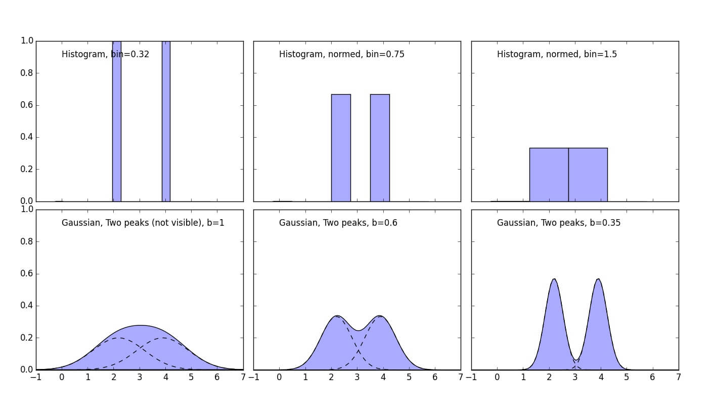 In the lower graphs it's nice visualization how Gaussians sum up and how bandwidth value affects the form of final PDF.
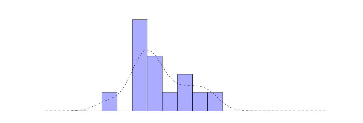
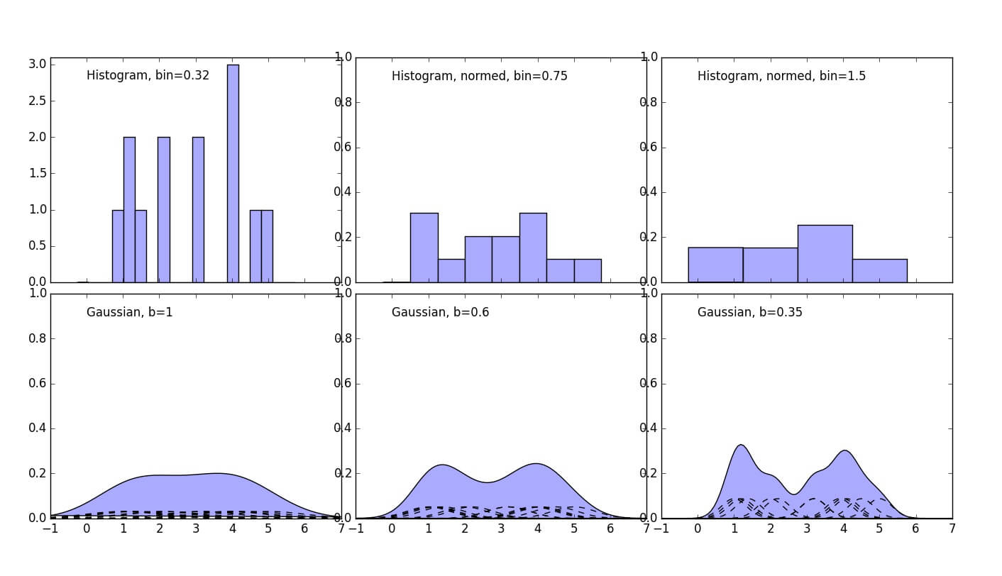
Multiple data points example
Multiple points example is the most realistic, the dataset is still a made-up of two Gaussians here.
1 2 3 4 5 6 7 8 9 10 11 12 13 14 15 16 17 18 19 20 21 22 23 24 25 26 27 28 29 30 31 32 33 34 35 36 37 38 39 40 41 42 43 44 45 46 47 48 49 50 51 52 53 54 55 | import numpy as np import matplotlib.pyplot as plt #https://en.wikipedia.org/wiki/Gaussian_function def gaussian(x,b=1): return np.exp(-x**2/(2*b**2))/(b*np.sqrt(2*np.pi)) #Let's use Numpy normal distribution generator X=np.random.normal(2.5, 0.9, 14) N=len(X) # Plot all available kernels X_plot = np.linspace(-1, 7, 100)[:, None] bins = np.linspace(-1, 5, 20) bins[1]-bins[0] fig, ax = plt.subplots(2, 3, sharex=True, figsize=(14,8)) fig.subplots_adjust(left=0.05, right=0.95, hspace=0.05, wspace=0.05) ax[0, 0].set_ylim([0,3.1]) ax[0, 1].set_ylim([0,1]) ax[0, 2].set_ylim([0,1]) ax[1, 0].set_ylim([0,1]) ax[1, 1].set_ylim([0,1]) ax[1, 2].set_ylim([0,1]) ax[0, 0].hist(X[:], bins=bins + 0.75, fc='#AAAAFF', normed=False) ax[0, 0].text(0, 2.8, "Histogram, bin=0.32") bins = np.linspace(-1, 5, 9) bins[1]-bins[0] ax[0, 1].hist(X[:], bins=bins + 0.75, fc='#AAAAFF', normed=True) ax[0, 1].text(0, 0.9, "Histogram, normed, bin=0.75") bins = np.linspace(-1, 5, 5) bins[1]-bins[0] ax[0, 2].hist(X[:], bins=bins + 0.75, fc='#AAAAFF', normed=True) ax[0, 2].text(0, 0.9, "Histogram, normed, bin=1.5") sum1=np.zeros(len(X_plot)) sum2=np.zeros(len(X_plot)) sum3=np.zeros(len(X_plot)) for i in range(0, N): ax[1, 0].plot(X_plot, (gaussian(X_plot-X[i]))/N, '-k', linestyle="dashed") sum1+=((gaussian(X_plot-X[i]))/N)[:,0] ax[1, 1].plot(X_plot, (gaussian(X_plot-X[i],0.6))/N, '-k', linestyle="dashed") sum2+=((gaussian(X_plot-X[i],0.6))/N)[:,0] ax[1, 2].plot(X_plot, (gaussian(X_plot-X[i],0.35))/N, '-k', linestyle="dashed") sum3+=((gaussian(X_plot-X[i],0.35))/N)[:,0] ax[1, 0].fill(X_plot, sum1, '-k', fc='#AAAAFF') ax[1, 0].text(0, 0.9, "Gaussian, b=1") ax[1, 1].fill(X_plot, sum2, '-k', fc='#AAAAFF') ax[1, 1].text(0, 0.9, "Gaussian, b=0.6") ax[1, 2].fill(X_plot, sum3, '-k', fc='#AAAAFF') ax[1, 2].text(0, 0.9, "Gaussian, b=0.35") fig.savefig("Many_Points_Example.jpg") |
Practical Task
To get deeper understanding of KDE we strongly recommend to take a look at practical task using KDE.
Download Code
Download the code from this tutorial from our GitHub channel.