Base R Plot Series (Part = 1): Line Graph
We introduce a "back to basics" series of R plots using only base R - no ggplot, no ggplot2. Other parts of the series:
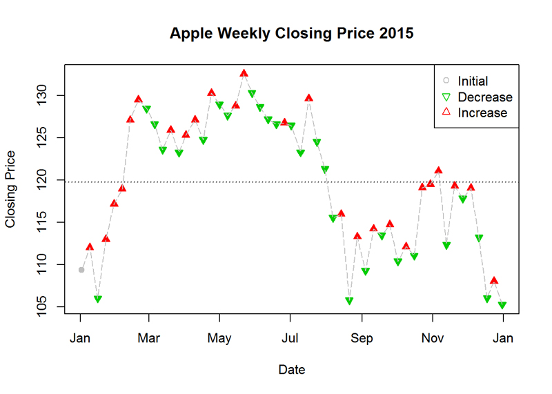
Plot me a Line Graph (and a bit more)!
Task: Create a graph by using the dataset of Apple (AAPL) weekly stock prices for 2015. The
horizontal line is the mean. The data can be found at: “http://real-chart.finance.yahoo.com/table.csv?s=
AAPL&a=00&b=1&c=2015&d=11&e=31&f=2015& g=w&ignore=.csv”
Method: R Studio, Base R
Dataset: Financial time series (in script download)
Code & Result
df_apple <- read.csv(url('http://real-chart.finance.yahoo.com/table.csv?s=AAPL&a=00&b=1&c=2015&d=11&e=31&f=2015& g=w&ignore=.csv'))
# change Date data type
df_apple$Date <- as.Date(df_apple$Date)
# add column with week numbers to data frame
df_apple <- cbind(df_apple, Week = format(df_apple$Date, format = "%W"))
# leave only the last entry for each week
df_apple <- df_apple[-which(duplicated(df_apple$Week), TRUE), ]
# add symbols for decrease and increase
pch = rep(21, length(df_apple$Close))
col = rep(8, length(df_apple$Close))
for (i in 52:1) {
  if (df_apple$Close[i] > df_apple$Close[i+1]) {
    pch[i] <- 24
    col[i] <- 2
  } else {
    pch[i] <- 25
    col[i] <- 3
  }
}
# plot the graph
plot(df_apple$Date, df_apple$Close, pch = pch, col = col, bg = col, main = "Apple Weekly Closing Price 2015", ylab = "Closing Price", xlab = "Date")
lines(df_apple$Date, df_apple$Close, lty = 5, col = 8)
legend("topright", c("Initial", "Decrease", "Increase"), pch = c(21, 25, 24), col = c(8, 3, 2))
# add horizontal line
abline(h = mean(df_apple$Close), lty = 3)